Documentation
Semantic Map
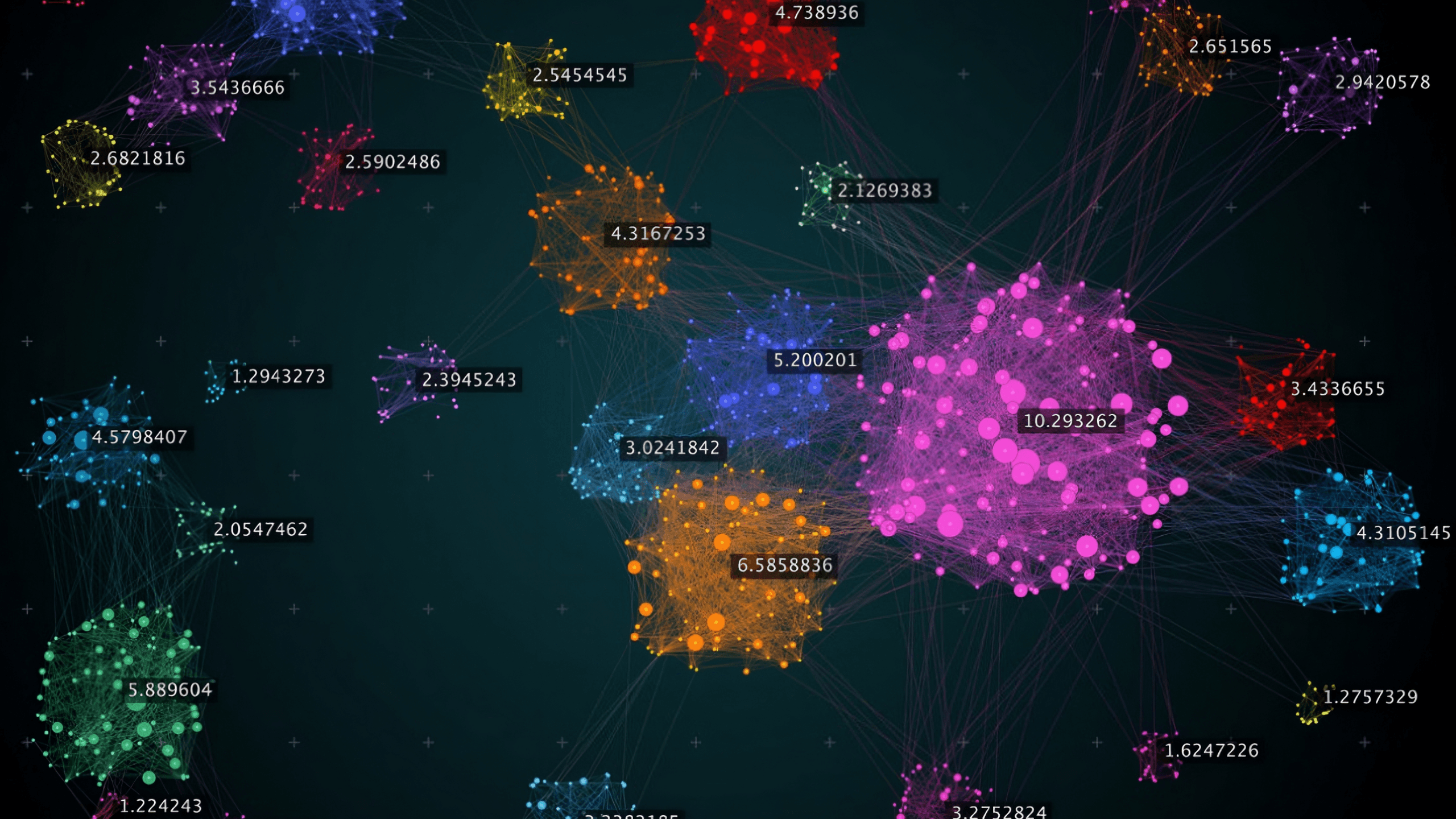
The Semantic Map is a powerful visualization tool that helps you understand what your AI assistant knows. It analyzes your uploaded documents and displays them as an interactive map, grouping related content into topics and highlighting areas that may need improvement.
What is the Semantic Map
The Semantic Map uses machine learning to analyze all the content in your knowledge base and organize it visually. Each dot on the map represents a piece of your content (a "chunk"), and dots that are close together share similar meaning.
Component | What It Shows |
|---|---|
Topics (Clusters) | Groups of related content automatically detected |
Points | Individual chunks from your documents |
Colors | Different colors represent different topics |
Unclustered Points | Content that doesn't fit neatly into any topic |
The map helps you answer questions like:
What topics does my AI know about?
Are any topics underrepresented?
Is my content well-organized or scattered?
Embeddings Representation
When you upload documents, each chunk is converted into a high-dimensional vector (an "embedding") that captures its semantic meaning. Chunks with similar meaning have similar vectors, even if they use different words.
Dimensionality Reduction
The map displays content in 2D, but embeddings exist in much higher dimensions. We use UMAP (Uniform Manifold Approximation and Projection) to project these high-dimensional vectors onto a 2D plane while preserving the relationships between them.
Points close together in the original space remain close in 2D
Points far apart remain separated
The resulting layout reveals natural groupings in your content
Clustering
Once projected to 2D, we use HDBSCAN (Hierarchical Density-Based Spatial Clustering) to automatically detect topic clusters. Unlike traditional clustering algorithms:
It doesn't require you to specify how many topics to find
It identifies "noise" (content that doesn't belong to any clear topic)
It handles clusters of varying sizes and densities
Topic Labeling
Each detected cluster is analyzed to generate a human-readable topic label. The system examines representative content from each cluster and produces a 2-4 word descriptive name (e.g., "Shipping & Returns", "Product Specifications").
Primary Stats
Metric | Definition | What It Tells You |
|---|---|---|
Topics | Number of distinct clusters detected | How many separate subjects your knowledge base covers |
Chunks | Total content pieces analyzed | Overall size of your knowledge base |
Clustered | Percentage of chunks belonging to a topic | How much of your content is well-organized |
Unclustered | Percentage marked as "noise" | Content that may be too unique or poorly organized |
Clustered vs. Unclustered:
High clustered % (>90%) = Well-organized content with clear topics
High unclustered % (>20%) = Scattered content, consider reorganizing
Silhouette Score
Range: -1 to +1
The Silhouette Score measures how similar each chunk is to its own cluster compared to other clusters. It evaluates both cohesion (how tightly grouped points are within a cluster) and separation (how distinct clusters are from each other).
Score | Interpretation |
|---|---|
0.7 – 1.0 | Excellent — Strong, well-separated clusters |
0.5 – 0.7 | Good — Clear structure with minor overlap |
0.25 – 0.5 | Fair — Clusters exist but boundaries are fuzzy |
0.0 – 0.25 | Weak — Overlapping or poorly defined clusters |
Below 0 | Poor — Points may be assigned to wrong clusters |
Mathematical intuition: For each point, the score compares its average distance to points in its own cluster versus the nearest neighboring cluster. A high score means points are much closer to their own cluster.
Calinski-Harabasz Index
Range: 0 to ∞ (higher is better)
Also known as the Variance Ratio Criterion, this metric measures the ratio of between-cluster dispersion to within-cluster dispersion.
Score | Interpretation |
|---|---|
Higher values | Better-defined, more separated clusters |
Lower values | Clusters are less distinct or overlapping |
Mathematical intuition: Compares how spread out clusters are from each other versus how spread out points are within each cluster. Well-defined clusters are tight internally but far apart from each other.
Note: This score is not normalized, so it's most useful for comparing different analyses of the same dataset rather than as an absolute measure.
Davies-Bouldin Index
Range: 0 to ∞ (lower is better)
This metric measures the average similarity between each cluster and its most similar neighboring cluster.
Score | Interpretation |
|---|---|
0 – 0.5 | Excellent — Clusters are very distinct |
0.5 – 1.0 | Good — Reasonable separation |
1.0 – 2.0 | Fair — Some cluster overlap |
Above 2.0 | Poor — Significant overlap between clusters |
Mathematical intuition: For each cluster, finds the neighboring cluster it's most similar to, then averages across all clusters. Lower scores indicate clusters that are compact and well-separated.
Quality Assesment
The overall Quality rating combines these metrics into a single assessment:
Rating | Criteria |
|---|---|
Excellent | Silhouette ≥ 0.7 |
Good | Silhouette 0.5 – 0.7 |
Fair | Silhouette 0.25 – 0.5 |
Poor | Silhouette < 0.25 |
Diagnostics
The Semantic Map provides four diagnostic analyses:
Diagnostic | What It Measures | Healthy State |
|---|---|---|
Noise Analysis | Percentage of unclustered content | <10% unclustered |
Balance | Distribution of content across topics | No single topic >50% |
Depth | Content volume per topic | All topics have ≥5 chunks |
Organization | Overall cluster quality | Multiple distinct topics detected |
Severity indicators:
Green: No issues detected
Blue: Minor observation
Yellow: Moderate concern worth addressing
Red: Significant issue affecting chatbot quality
Advance Settings
For fine-tuning the analysis, you can adjust clustering parameters:
Parameter | Range | Default | Technical Effect |
|---|---|---|---|
Minimum Cluster Size | 2–50 | 3 | Minimum points required to form a cluster. Lower values detect smaller, more specific topics. Higher values require more evidence before creating a topic. |
Neighbor Sensitivity | 2–100 | 15 | Number of neighbors considered when projecting to 2D. Lower values preserve local structure (fine-grained patterns). Higher values preserve global structure (broad patterns). |
Density Threshold | 1–10 | 2 | Minimum points in a neighborhood to be considered a core point. Higher values require denser clusters, reducing noise sensitivity. |
When to adjust:
Symptom | Try This |
|---|---|
Too many tiny topics | Increase Minimum Cluster Size |
Topics are too broad | Decrease Minimum Cluster Size |
Related content split across topics | Increase Neighbor Sensitivity |
Unrelated content grouped together | Decrease Neighbor Sensitivity |
Too much noise (unclustered) | Decrease Density Threshold |
Loose/scattered clusters | Increase Density Threshold |
Results
Healthy Knowledge Base Signs:
5–15 topics (varies by use case)
>90% clustered content
Silhouette score >0.5
Balanced topic sizes (no single topic dominates)
All diagnostics green or blue
Warning Signs:
Issue | Possible Cause | Solution |
|---|---|---|
Very few topics (1-2) | Content is too similar or too limited | Add diverse content covering different subjects |
Many tiny topics | Content is too fragmented | Consolidate related documents |
High unclustered % | Documents cover many unrelated subjects | Reorganize into focused topic files |
Low Silhouette score | Topics overlap significantly | Separate content more clearly by subject |
One dominant topic | Knowledge base is unbalanced | Add content for underrepresented areas |
Quick Reference
Task | How To |
|---|---|
Run analysis | Training → Semantic Map → Run Analysis |
Filter by topic | Click a topic in the sidebar |
View all topics | Click "Show All" in the sidebar |
View chunk content | Click any point on the map |
Adjust settings | Click the settings icon |
Reset view | Click "Reset View" after panning/zooming |
Re-analyze | Click "Re-run" in the header |